Most investors decide whether to reply in under 60 seconds. A 15-slide deck won’t get read in cold outreach, but a sharp one-pager can land you a meeting. It’s your elevator pitch on paper: problem, solution, traction, team, and ask—all visible without scrolling.
This guide walks through exactly what goes into an investor one-pager, shows real examples from funded startups, provides a ready-to-use template structure, and explains when to use it versus a full pitch deck. You’ll also learn design best practices and common mistakes that kill interest.
Table of Contents
- What is an investor one-pager and when to use it
- Essential elements every one-pager must include
- Design principles that make investors read (not skip)
- Template structure with real startup examples
- One-pager vs pitch deck: when to send which
- Common mistakes and how to avoid them
- Frequently asked questions about investor one-pagers
1. What is an investor one-pager and when to use it
1.1 The purpose of a one-pager
An investor one-pager is a single-page summary of your startup designed to hook attention and earn a meeting. It condenses your value proposition, market opportunity, traction, team, and funding ask into a visual format that investors can digest in 30–90 seconds.
Think of it as your business card, pitch deck executive summary, and leave-behind all in one. It’s not meant to close a deal—it’s meant to start a conversation.
1.2 When to use a one-pager vs pitch deck
Use a one-pager when:
- Cold emailing investors (attachment or PDF link)
- Networking events and conferences (printed handouts)
- Quick follow-ups after brief introductions
- Warm intro requests (“can you send me something quick?”)
- Pitch competitions where you have 60 seconds
Use a pitch deck when:
- Formal investor meetings (in-person or Zoom)
- Due diligence deep dives
- Partner presentations at VC firms
- Fundraising data rooms
Many founders send the one-pager first, then follow with the full deck once interest is established. A founder at NREL Industry Growth Forum reported using an 11×17 printed one-pager to guide nine investor meetings, keeping conversations focused and leaving a memorable visual behind.
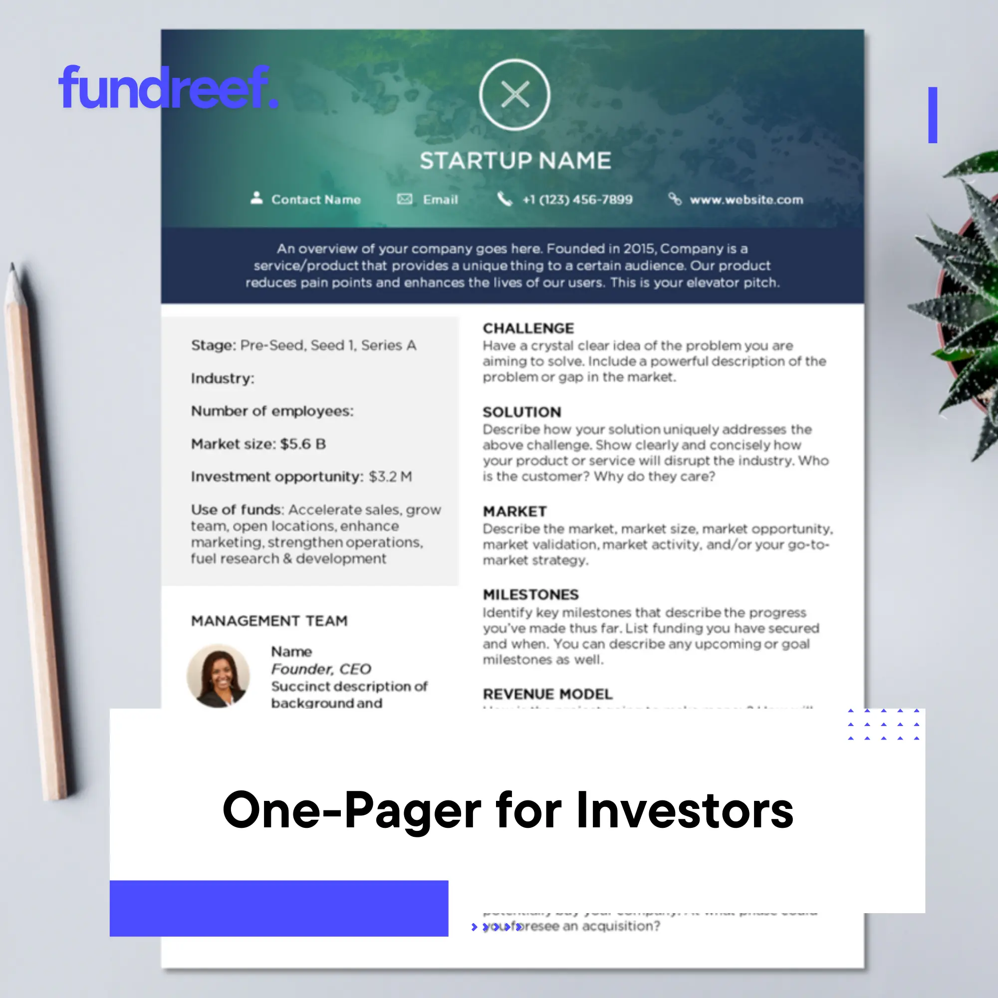
2. Essential elements every one-pager must include
2.1 The core components
Your one-pager should answer the questions every investor asks in the first 60 seconds:
- Company name and tagline – What you do in 5–10 words
- Problem – The pain point you’re solving (1–2 sentences)
- Solution – Your product/service and how it works (2–3 sentences)
- Market opportunity – TAM, addressable market, or target customer count
- Traction – Key metrics (revenue, users, growth rate, pilots, customers)
- Business model – How you make money (pricing, unit economics)
- Competitive advantage – Why you win vs alternatives
- Team – Founders and key hires with relevant credentials
- The ask – How much you’re raising, what stage, use of funds
- Contact – Email, website, social proof (investors, accelerators)
Optional but powerful: customer logos, media mentions, awards, or a QR code linking to a demo or deck.
2.2 What to emphasize by stage
Pre-seed/seed: Team credentials, problem clarity, early traction signals (pilots, waitlist, LOIs).
Series A: Revenue, growth rate, unit economics, customer retention.
Series B+: Scale metrics, market position, path to profitability.
Adjust the visual hierarchy to spotlight your strongest point. If you have $500k ARR growing 20% month-over-month, make that the centerpiece. If you’re pre-revenue but have Stanford PhD founders with DARPA grants, lead with team and technology.
3. Design principles that make investors read (not skip)
3.1 Visual hierarchy and white space
Investors scan, they don’t read. Use visual hierarchy to guide their eyes:
- Large, bold headline (company name + tagline)
- Mid-size section headers (Problem, Solution, Traction)
- Body text in concise bullets, not paragraphs
- Generous white space (40–50% of the page should be empty)
Cluttered one-pagers get skipped. Clean, breathing layouts get remembered.
3.2 Use charts, icons, and minimal text
Replace paragraphs with:
- Revenue growth chart (line graph)
- Customer logos (if recognizable brands)
- Icons for key features or differentiators
- Team photos (humanizes your pitch)
Aim for 100–150 words of body text total. If you need three paragraphs to explain the problem, simplify or your product is too complex.
3.3 Brand consistency and professionalism
Use your brand colors, logo, and fonts consistently. Avoid:
- Stock photo clichés (handshakes, corporate team huddles)
- Tiny fonts (<10pt)
- Low-resolution images
- Rainbow color schemes
Professional doesn’t mean boring. Tools like Visme, Canva, or Figma offer clean startup one-pager templates that you can customize in 30 minutes.
4. Template structure with real startup examples
4.1 Standard layout blueprint
Here’s a proven vertical layout structure:
Top Third (Header Zone)
- Company name and tagline (large, bold)
- Logo + contact info + website
- Social proof badges (YC, Techstars, Forbes 30 Under 30, etc.)
Middle Third (Core Story)
- Problem (left column): 2–3 bullet points or a single sentence
- Solution (right column): Product screenshot + 3–4 feature bullets
- Market (full width): TAM number + target customer profile
Bottom Third (Proof & Ask)
- Traction (left): Key metrics (MRR, users, growth %, NRR)
- Business Model (center): Revenue streams, pricing
- Team (right): Founder photos + 1-line bios
- The Ask (footer bar): “Raising $3M Seed | contact@startup.com“
4.2 Real-world one-pager example breakdown
Example: Hypothetical B2B SaaS “TaskFlow”
| Section | Content |
|---|---|
| Header | TaskFlow – AI-powered workflow automation for mid-market teams Y Combinator W24 | Forbes Next Billion-Dollar Startup |
| Problem | – Teams waste 12 hours/week on manual task handoffs – Existing tools require engineering to customize |
| Solution | TaskFlow lets non-technical teams build custom workflows in minutes using AI templates [Product screenshot showing drag-and-drop interface] |
| Market | $8B TAM – 500k mid-market companies in US alone |
| Traction | $400k ARR | 120% NRR | 85 paying customers | 3.2% weekly growth |
| Business Model | $15–50/user/month SaaS – Average ACV $18k – 18-month payback |
| Competitive Edge | Only platform with AI auto-suggest + native integrations to 200+ tools |
| Team | Jane Doe (ex-Asana PM, Stanford CS) – John Smith (2x exits, Salesforce eng) |
| The Ask | Raising $2.5M Seed – contact@taskflow.io – [QR to pitch deck] |
4.3 Variations by format
Landscape (11×17 for events): Use left/right split—story on left, visuals/metrics on right.
Portrait (8.5×11 for email): Vertical flow as described above.
Digital PDF: Include clickable links and QR codes to deck, demo video, or product tour.
5. One-pager vs pitch deck: when to send which
5.1 The sequencing strategy
Most successful fundraises follow this flow:
- Cold outreach: One-pager in email or LinkedIn message
- Warm intro response: “Looks interesting, send me your deck”
- First meeting: Walk through pitch deck live
- Follow-up: Send deck + one-pager recap
The one-pager is your opener and your reminder. The deck is your deep dive.
5.2 What investors say
Reddit and founder forums consistently report: cold emails with 15-slide decks get ignored; cold emails with a sharp one-pager get 3–5x response rates. One founder reported: “I switched from sending my deck to sending a one-pager. Response rate went from 2% to 12%.”
Why? Decks feel like commitment. One-pagers feel like curiosity.
5.3 Building your outreach list efficiently
When you’re ready to execute cold outreach to 50–100 investors, you need clean contact info and context (recent deals, sector focus, ticket size). Manually building this from Crunchbase, LinkedIn, and fund websites takes weeks.
Platforms like Fundreef let you filter 10,000+ active investors by stage, geography, and sector, then export contact-ready lists with recent portfolio companies—so you can focus on crafting a killer one-pager instead of hunting for emails.
6. Common mistakes and how to avoid them
6.1 Too much text
If your one-pager looks like a Word document, you’ve failed. Investors won’t read paragraphs. Cut everything by 50%, then cut again. Aim for 100–150 words total.
6.2 No clear ask
“We’re fundraising” is vague. Be specific: “Raising $3M seed, $1.5M committed, closing in 6 weeks.” Clarity creates urgency.
6.3 Generic buzzwords
Avoid: “revolutionary AI-powered platform disrupting the landscape.” Use: “Automated workflow tool saving teams 12 hours/week, proven with 85 customers.”
6.4 Ignoring the visual test
Print your one-pager and tape it to a wall. Walk 6 feet away. Can you read the headline? Can you identify the 3 most important points in 5 seconds? If not, redesign.
6.5 No social proof
Investors pattern-match. Even small signals matter: “Backed by angels from Google, Stripe” or “Y Combinator W24” or “Featured in TechCrunch.” If you have none, lean harder on team credentials and traction.
Frequently Asked Questions About Investor One-Pagers
What is a one-pager for investors?
A one-pager is a single-page document summarizing your startup’s problem, solution, market, traction, team, and funding ask. It’s designed to be read in 30–90 seconds and used in cold outreach, networking events, or as a leave-behind after meetings.
When should I use a one-pager vs a pitch deck?
Use a one-pager for cold outreach, warm intro requests, networking events, and quick follow-ups. Use a pitch deck for formal investor meetings, partner presentations, and due diligence. Many founders send the one-pager first to hook interest, then follow with the deck.
What should I include in an investor one-pager?
Essential elements: company name/tagline, problem, solution, market size, traction metrics, business model, competitive advantage, team, funding ask, and contact info. Optional: customer logos, media mentions, QR codes to deck or demo.
How much text should be on a one-pager?
Aim for 100–150 words total body text, not counting headers and labels. Use bullet points, charts, and icons instead of paragraphs. If it feels dense, cut more. White space improves readability and retention.
Should I print my one-pager or send it digitally?
Both. Send as a PDF in cold emails and attach to LinkedIn messages. Print high-quality copies (11×17 landscape or 8.5×11 portrait) for pitch events, conferences, and in-person meetings. Include QR codes on printed versions linking to your deck or demo.
What design tools should I use to create a one-pager?
Canva, Visme, Figma, or PowerPoint all work well. Use templates designed for startup one-pagers to ensure good visual hierarchy and white space. Avoid Word documents—they rarely format well for this purpose.