

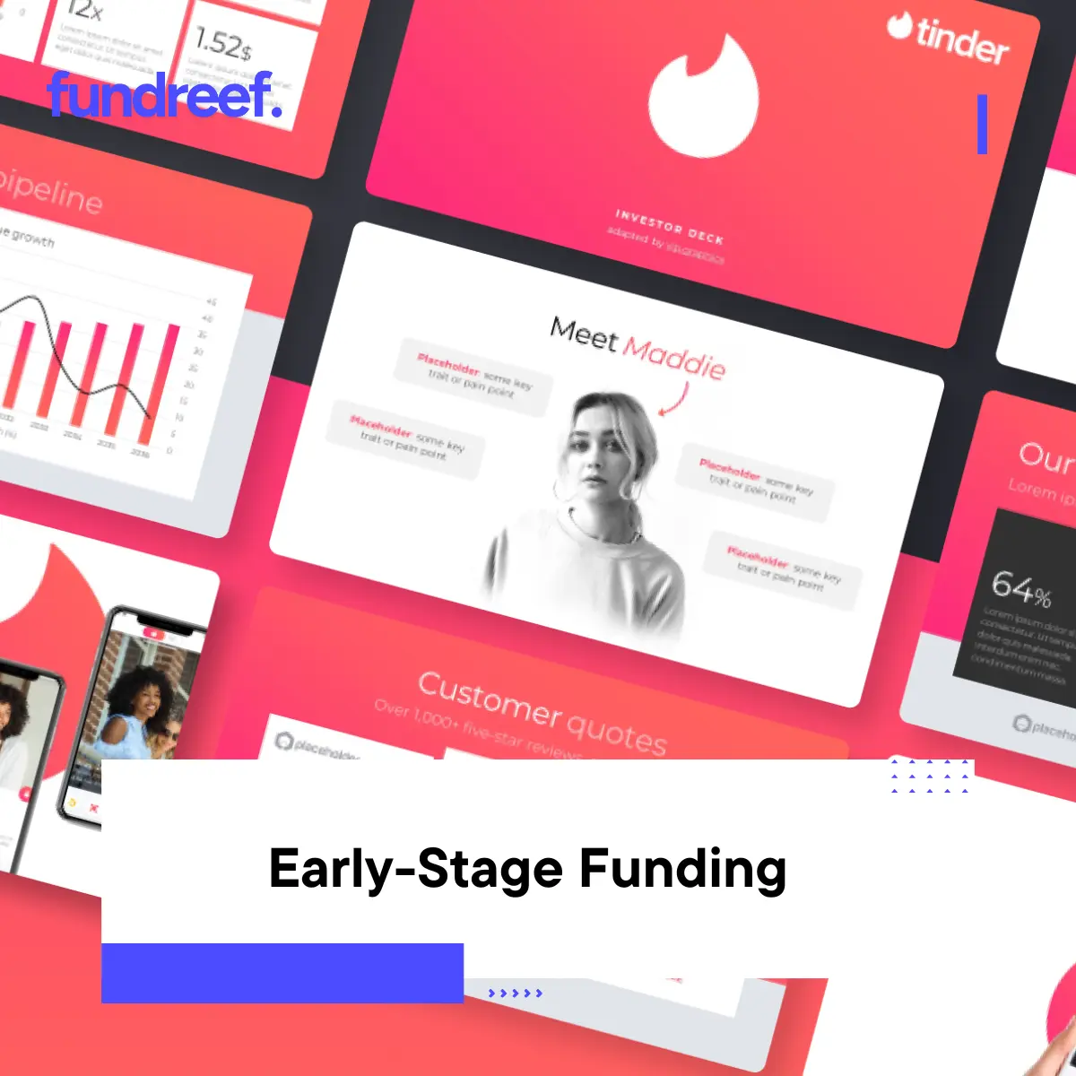
Learn how Tinder’s 2012 pitch deck secured funding from IAC. Analyze 15 slides that turned a dating app prototype into a $3B company with proven strategies.
Sean Rad built the Tinder prototype during a weekend hackathon in February 2012 at IAC’s Hatch Labs incubator in West Hollywood. Within 19 months, the app was valued at $500 million. By April 2014, IAC purchased additional stake at a valuation some reports pegged near $5 billion. The pitch deck that started it all wasn’t fancy—no custom illustrations, no expensive design agency, just 15 slides that nailed the fundamentals of storytelling.
Most pitch decks fail because founders explain their product in ways that make sense to them but confuse investors who see the deck cold. Tinder’s team understood this. They built their narrative around a universal human experience, showed the solution visually, and let early traction speak for itself.
Table of Contents
- Why the Tinder Pitch Deck Still Matters in 2025
- The Matchbox Deck: Breaking Down Each Section
- What Made Tinder’s Story Work
- Lessons for Consumer App Founders
- Common Pitch Deck Mistakes Tinder Avoided
- How to Structure Your Dating or Social App Deck
- Frequently Asked Questions About Building Winning Pitch Decks
Why the Tinder Pitch Deck Still Matters in 2025
Dating apps raised $891 million globally in 2024, but only 12% of pitches secure institutional funding. The gap between companies that raise and those that don’t often comes down to narrative clarity—not product superiority. Tinder’s deck proves this. They didn’t have revolutionary technology. Swipe mechanics existed before Tinder. Photo-based matching wasn’t new. What they had was a story that investors could feel, not just understand intellectually.
The deck came together when Tinder was still called MatchBox, operating inside Hatch Labs—a joint venture between IAC and mobile developer Xtreme Labs. The ownership structure was murky from the start. Rad originally proposed founder-friendly terms giving the founding team majority ownership while Hatch Labs held a minority stake. IAC agreed, which explains why a deck even existed despite the company being incubated internally.
Consumer apps in 2025 face similar storytelling challenges. You’re not selling enterprise software where ROI calculations drive decisions. You’re selling behavior change, cultural shifts, and emotional engagement. The mechanics that made Tinder’s deck work—personal problems, immediate visual solutions, cultural framing—apply directly to today’s consumer pitches whether you’re building social, dating, wellness, or creator economy tools.
The Matchbox Deck: Breaking Down Each Section
The original Tinder pitch deck contained roughly 15 slides covering problem, solution, market, traction, business model, and team. Unlike modern decks stuffed with data visualizations and market sizing circles, Tinder kept it stripped down and narrative-focused.
Opening Hook: Make It Personal
The deck opened with a scenario, not a statistic. “Have you ever been attracted to someone but didn’t know if they felt the same way?” That single question did more work than three slides of dating market analysis could accomplish. Every investor reading it immediately recalled that feeling—the uncertainty, the fear of rejection, the internal calculation of whether to make a move.
This approach matters because early-stage consumer investing is pattern recognition applied to human behavior. Investors back founders who identify behavioral truths others miss. Starting with an emotional hook proves you understand user psychology at a fundamental level.
Compare this to weak openings like “The online dating market is worth $3.5 billion annually” or “Modern singles struggle to find meaningful connections.” Those statements are generic. They don’t create an emotional entry point. Tinder’s question did.
Problem Definition: Show the Gap
Tinder didn’t waste slides explaining why online dating existed or detailing Match.com’s business model. They focused on the specific gap: mutual attraction validation. Existing dating sites made you fill out extensive profiles, browse hundreds of options, and initiate contact without knowing if interest was reciprocated. The fear of rejection prevented action.
This specificity is critical. Too many decks explain broad problems that everyone already understands. “Dating is hard.” “Meeting people takes time.” These aren’t insights. Tinder identified the psychological barrier—uncertainty about mutual interest—that existing solutions didn’t address.
The deck framed this as a college campus problem first. Students see attractive people in classes, at parties, in dorms. Proximity exists but social friction prevents connection. That narrow focus gave Tinder a wedge into a reachable market segment with organic growth potential.
Solution Slides: Visual and Immediate
Tinder explained their solution in three words: swipe right, swipe left. The deck included mobile screenshots showing the interface—a profile photo with minimal text, two simple gestures, and matches revealed only when mutual interest existed. No lengthy explanations of algorithm mechanics. No technical architecture diagrams.
This visual simplicity let investors immediately grasp the user experience. You see someone attractive, you swipe right. If they also swiped right on you, you match. If not, neither party knows. The fear of rejection disappeared because unsuccessful swipes remained anonymous.
The deck positioned this as solving Matt’s problem—a persona they introduced earlier. Matt sees someone attractive in class but doesn’t know how to approach her without risking public rejection. With Tinder, Matt can express interest privately. Only if she reciprocates does the connection become visible.
Persona-driven storytelling works when the persona represents your target user accurately. Matt wasn’t fictional—he was every college guy on campus. Female investors could relate to being on the receiving end of awkward advances. The universality of the scenario made the solution feel inevitable.
Market Positioning: Start Small, Think Big
Here’s where Tinder made a smart call that most founders miss. They didn’t open with “350 million singles globally” or massive TAM circles. They started with college students who own smartphones—a segment small enough to dominate quickly but large enough to prove concept.
The deck showed roughly 20 million American college students at any time, concentrated in dense campus environments where word-of-mouth spreads fast. Homogeneous demographics (18-25 years old, tech-savvy, unmarried) meant product-market fit signals would show up quickly. If the app worked at USC, it would work at Michigan, then NYU, then everywhere.
This wedge strategy gave Tinder credibility. Investors could see a realistic path to initial traction without requiring massive marketing budgets. College campuses offered built-in distribution through Greek life, dorms, and social networks. Once you hit critical mass on one campus, replication became mechanical.
| Market Approach | Tinder’s Strategy | Why It Worked |
|---|---|---|
| Initial Target | College students with smartphones | Dense, reachable, viral-ready |
| Geographic Focus | Campus-by-campus rollout | Word-of-mouth within confined communities |
| Expansion Path | College → young professionals → broader | Natural aging of user base |
| Market Size | 20M students → 130M singles → global | Credible progression from wedge to TAM |
The deck then showed expansion beyond students. Young professionals in cities faced similar problems—tons of proximity but no friction-free way to express interest. Tinder’s mechanics worked anywhere single people congregated. That gave investors the billion-dollar vision while keeping initial execution grounded.
If you’re trying to identify which investors actually fund apps in your category at your stage, spending three weeks manually researching funds wastes time you could spend improving your product. Platforms that let you filter thousands of active investors by sector focus, check size, and geographic preference cut that research from weeks to hours.
Traction Metrics: Show Momentum, Not Scale
Tinder’s deck didn’t claim millions of users because they didn’t have millions yet. What they had was momentum: matches per day accelerating, campus-by-campus growth showing predictable patterns, and engagement metrics proving the core loop worked.
Within six months of launch, Tinder hit over 500,000 monthly active users. The deck likely showed earlier numbers—possibly 50,000-100,000 users across initial test campuses—but the trend line was unmistakable. User growth was exponential, not linear.
More importantly, they showed behavioral data. Average session time, daily opens, match rates, and conversation initiation all indicated users weren’t just downloading the app—they were using it compulsively. That behavior signal matters more than absolute user numbers at early stages.
Investors evaluate consumer apps on engagement intensity, not vanity metrics. Ten thousand users opening your app 8x daily beats 100,000 users who open once per week. Tinder proved engagement intensity through campus dominance. When 30-40% of students at a target school used Tinder daily, expansion to the next campus became inevitable.
Business Model: Credible Without Being Certain
Tinder’s monetization slide took a smart approach—show you’re thinking about revenue but don’t over-promise what you can’t prove yet. The deck outlined potential paths: freemium features, premium subscriptions, possibly advertising. They didn’t forecast “$50M ARR by Year 3” because they had no data to support that.
This honesty worked. Early-stage consumer investors know monetization gets figured out post-traction. They want to see you understand levers you could pull eventually: premium features for power users, virtual goods, subscription tiers, B2B licensing. Listing options without committing to specifics shows strategic thinking without dishonest precision.
When Tinder did monetize years later, they used several of these paths—Tinder Plus and Tinder Gold subscriptions, Super Likes as purchasable features, Boost for visibility. But forcing those specifics into a 2012 seed deck would have felt premature.
Team Slide: Show Why You’re the Right Founders
Tinder’s team wasn’t stacked with exits or Stanford PhDs. Sean Rad had entrepreneurial experience but no billion-dollar exits. What they had was domain understanding—they lived the problem. Young founders building for young users, understanding campus social dynamics from lived experience, not market research.
The deck emphasized this. They weren’t consultants analyzing the dating market from outside. They were the target user. That insider perspective gave them conviction about product decisions that data couldn’t provide yet.
Investors back founders who have earned the right to solve specific problems. Health tech founders need medical or scientific backgrounds. Fintech founders need payments or banking experience. Dating and social founders need deep understanding of social dynamics in their target demographic. Tinder’s team had that.
What Made Tinder’s Story Work
Strip away the specific product and what remains is narrative structure that works across categories. Tinder succeeded because they understood storytelling fundamentals most founders ignore.
They Chose Clarity Over Comprehensiveness
The deck left tons of information out. No detailed competitive analysis. No five-year financial projections. No slide explaining mobile technology trends. Every omission was intentional. They trusted investors to be smart enough to connect dots without hand-holding.
Most decks fail because founders try to answer every possible question preemptively. That creates information overload. Tinder gave you just enough to grasp the concept, see why it mattered, and want to hear more. The pitch meeting filled in details. The deck’s job was creating that meeting.
They Made It About Behavior Change, Not Features
Tinder didn’t pitch “a mobile app with geolocation and photo matching.” They pitched “changing how people express attraction in real life.” The first is a feature list. The second is a cultural shift.
Investors fund companies that change behavior at scale. Uber changed how people think about transportation. Airbnb changed how people think about lodging. Instagram changed how people share moments. Tinder changed how people initiate romantic connection.
Framing your product as a behavioral movement rather than a feature set requires understanding what your product represents culturally, not just what it does functionally. Most founders never make this leap. They stay stuck explaining features when they should be explaining the world after mass adoption.
They Used Constraints as Advantages
Starting with college campuses wasn’t settling for a small market—it was strategic constraint. Limited scope meant faster validation, clearer product-market fit signals, and organic distribution. Once proven, expansion became replication.
Founders often fight constraints, wanting to be everything to everyone immediately. Tinder embraced them. “We’re starting with college students” sounds focused and executable. “We’re targeting all singles globally” sounds naive.
Lessons for Consumer App Founders
Tinder’s deck offers specific lessons applicable to dating apps, social networks, creator tools, and any consumer product where behavior change drives value.
Front-Load the Emotional Hook
Your opening slide should make investors feel something, not think something. Statistics make people think. Scenarios make people feel. “Have you ever felt awkward approaching someone you’re attracted to?” beats “The dating market is $3.5B annually.”
Test your hook by showing it to someone who knows nothing about your product. If they immediately nod or recall a personal experience, it works. If they look confused or ask clarifying questions, it’s too abstract.
Show the User Experience, Don’t Just Describe It
Screenshots, mockups, or prototypes do more work than paragraphs of explanation. Tinder showed what swiping looked like. Investors could visualize using the app in seconds.
If you’re pre-product, use mockups. If you have a prototype, record a 30-second video showing the core interaction. Embed it or include QR codes linking to it. The more visceral you make the experience, the faster comprehension happens.
Pick a Wedge You Can Actually Dominate
Your initial market should be small enough to capture 30-40% share within 12-18 months but large enough to prove your concept works at scale. College campuses worked for Tinder. What’s your equivalent?
| Wedge Criteria | Good Example | Bad Example |
|---|---|---|
| Size | 20M college students | 350M global singles |
| Density | Campus communities with daily interaction | Scattered individuals across countries |
| Homogeneity | 18-25, tech-savvy, unmarried | All demographics simultaneously |
| Word-of-mouth | Greek life, dorms, classes | Generic “viral marketing” |
| Proof point | 40% penetration at USC | 1% penetration across US |
Building your investor target list is the least fun part of fundraising but one of the most important. Rather than spending weeks on Google and LinkedIn compiling lists manually, tools that aggregate investor databases with filtering by stage, sector, and check size turn a three-week research project into a three-hour task.
Let Traction Speak Louder Than Projections
Real numbers from real users beat projections every time. If you have 10,000 users with 35% week-4 retention, lead with that. Don’t bury it behind market size slides.
Early traction isn’t about scale—it’s about proof. Proof that people want this. Proof that they come back. Proof that they tell friends. Show the energy, not the endpoint.
Common Pitch Deck Mistakes Tinder Avoided
Understanding what Tinder didn’t do matters as much as what they did. These mistakes kill most consumer pitches.
They Didn’t Oversell the Technology
Swiping isn’t technically complex. Geolocation existed. Photo matching existed. Tinder didn’t pretend they invented new technology. They combined existing tools in a novel way that changed user behavior.
Founders building consumer apps often oversell technical difficulty because they’re worried investors won’t see enough defensibility. That’s the wrong concern. Consumer apps get defended through network effects and brand, not patents. Focus on behavioral moats, not technical ones.
They Didn’t Inflate Market Size
Showing $100 billion TAM with three overlapping circles impresses nobody. Investors know you pulled that from a Gartner report. Tinder started with a realistic wedge, then showed logical expansion.
Be honest about your entry point. “We’re starting with 20M college students, then expanding to young professionals (80M), then broader singles market (130M)” shows thoughtful sequencing. “We’re targeting the $3.5B online dating market” shows lazy thinking.
They Didn’t Spend Slides on Competition
Tinder’s deck likely mentioned Match.com, OkCupid, and eHarmony but didn’t dedicate multiple slides to competitive matrices. Why? Because they fundamentally redefined the category. Comparing feature lists misses the point when you’re changing the behavior itself.
If you’re truly innovative, competition slides waste space. If you’re iterating on existing solutions, you need them. Know which category you’re in.
They Didn’t Fake Precision on Unknowable Numbers
Year 3 revenue projections for a pre-revenue consumer app are fiction. Tinder didn’t pretend otherwise. They showed monetization options without false precision about adoption rates and ARPU.
Investors respect honesty about uncertainty. “We believe we can monetize through these three paths, but we need traction data before committing to specifics” beats “We project $47M in Year 3 revenue” when you have zero paying customers.
How to Structure Your Dating or Social App Deck
Use this framework whether you’re building dating, social, creator tools, or any consumer product where engagement drives value.
Slides 1-3: Problem Setup
- Hook with emotional scenario (1 slide)
- Show the behavioral gap existing solutions miss (1 slide)
- Introduce a persona who embodies this problem (1 slide)
Slides 4-6: Solution
- Core mechanic explained visually (1-2 slides)
- Show the user experience through screenshots/mockups (1-2 slides)
- Explain why this changes behavior, not just what it does (1 slide)
Slides 7-9: Market Opportunity
- Initial wedge market with specific numbers (1 slide)
- Expansion path from wedge to broader TAM (1 slide)
- Why this wedge gives you distribution advantages (1 slide)
Slides 10-12: Traction (if applicable)
- User growth trajectory (1 slide)
- Engagement metrics showing retention and usage intensity (1 slide)
- Qualitative signals—user quotes, organic press, waitlist (1 slide)
Slides 13-14: Business Model & Team
- Monetization paths you could pursue (1 slide)
- Team backgrounds and why you’re positioned to win this market (1 slide)
Slide 15: The Ask
- Amount raising, what it funds, milestones it unlocks (1 slide)
Keep the deck to 15 slides maximum. If you need more space to tell your story, you’re not being selective enough about what matters.
Frequently Asked Questions About Building Winning Pitch Decks
How long should a pitch deck be for a consumer app?
Keep it to 12-15 slides maximum. Investors typically spend 3-4 minutes on initial deck review, which means roughly 15-20 seconds per slide. If your deck runs 25 slides, you’re asking for 8+ minutes of attention you won’t get. Tinder’s deck worked at 15 slides because every slide did meaningful work. Cut ruthlessly—if a slide doesn’t advance your narrative, it dilutes your story. You can always provide appendix slides with detailed data for investors who request more information.
Should I include a demo video in my pitch deck?
Yes, if your product’s value comes from user experience rather than complex technology. Dating apps, social networks, games, and consumer tools benefit enormously from 30-60 second demo videos showing the core interaction loop. Embed the video or include a QR code linking to it. Don’t rely solely on screenshots—movement and interaction communicate stickiness better than static images. Keep videos tight: show the problem, the solution in action, and one “wow” moment. Skip the music and narrator unless they’re exceptional quality.
What traction metrics matter most for consumer social apps?
Focus on engagement over growth. Investors want to see: daily active users divided by monthly active users (DAU/MAU ratio), week-4 retention (what percentage of new users are still active 28 days later), session frequency (how many times daily users open your app), and session duration (how long they stay). For social and dating apps specifically, interaction rates matter—what percentage of users send messages, make matches, or engage with content. Tinder proved product-market fit through matches per day and conversation rates, not just download numbers.
How technical should I get when explaining my product?
Stay at the user benefit level, not the implementation level. Explain what your product does and why users love it, not how your database architecture works or which APIs you’re using. Tinder explained swiping as a user behavior—see someone, swipe right if interested, match if mutual—without detailing their matching algorithm or geolocation implementation. Technical details belong in appendix slides or follow-up conversations with investors who want to dig deeper. Your deck’s job is creating excitement, not passing a technical review.
Can I use Tinder’s exact deck structure for my dating app?
The structure works but don’t copy it slavishly. What made Tinder’s deck effective was narrative clarity and emotional resonance specific to their product and moment. If you’re building a dating app in 2025, the landscape has changed—everyone knows swiping, skepticism about dating apps is higher, and investors want to see what’s different about your approach. Use Tinder’s principles (emotional hook, visual solution, wedge strategy, behavioral framing) but adapt them to your specific insight about what’s broken in dating now and how you’re fixing it.
How do I handle the competitive landscape slide for a dating app?
Don’t create a features matrix comparing your app to Tinder, Bumble, Hinge, and five others. Instead, show the behavioral shift that makes direct comparison misleading. Tinder didn’t compare features to Match.com—they showed a different approach to initiating connection. If your app truly innovates, explain what user behavior you’re changing that existing apps don’t address. If you’re iterating on existing models with better execution, focus on your specific wedge—maybe you dominate a demographic, geography, or use case others ignore. Positioning matters more than features.
